Wednesday, August 1, 2012

Ignorant Juries - By Design

I was reading this article about a judge prepping a jury for a patent infringement case between Apple and Samsung.  Given the horrendous state of the U.S. patent system, it seems to me that the more you understood about software patents, the more biased you would be and thus much less likely to ever be selected for this jury.  Additionally, the more you understood of the creative process, which really starts by copying (and then tweaking), the more biased you would be against design patents, Thus, it seems that the people most ignorant, and least qualified on the topic of patents are the ones deciding the verdict.

This made me realize that this phenomenon is probably not limited to software patents. In any field, the more informed you are about the topic, the more likely you would be labeled as biased toward a case.  Therefore, our judicial system would seem to be driven by those least qualified to make judgements.


To keep it in perspective though, what is likely a far worse problem is when attorneys choose jurors they think are the most malleable, rather than most qualified.  The judicial process then boils down to which attorney is the better salesperson and not whether there is actual guilt or innocence.

Wednesday, July 25, 2012

License Plate Sanity Restored

Stupid Design
About 3 years ago, Texas changed their license plate design to something that made them unreadable from more than 10 feet away.  I am sure they looked beautiful in a high-resolution, brightly lit setting to a committee of clueless overseers, but they failed to deliver on what should have been the number one requirement: readable at a distance in a variety of lighting conditions.

How does a group of people get put in charge of redesigning license plates and fail to deliver on the readability requirement?  How is is that at every step of the design and approval process no one ever raised this question? Did they ever even think to consult the number one user of the plates: law enforcement?  Would any police officer fail to spot this fatal design issue immediately?  This was an epic failure of government, committees and common sense.

It may not sound like it, but this is meant to be a positive, uplifting story. We come to that end by noting that Texas has corrected the problem and is (yet again) going to put out a new design, precisely to address the current problem of readability. And it took the Texas government only 3 years to recognize and fix the problem: maybe a new record.

This new design harken back to much older designs, and I like them a lot.  Simple, effective and functional.  Now I have to figure out how to trade in my plate for a new style one.
Sensible Design

Tuesday, July 17, 2012

Elevator Insanity

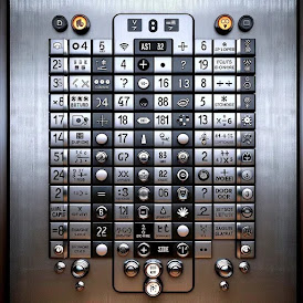
Having been in NYC the last 10 months, I have encountered more elevators than I previously have in the past.  I have grown to have some contempt for elevator manufacturers. I just do not understand why the very small number of manufacturers could not agree on some standards.  You have your "G", which could mean "ground floor" or it could mean "garage". You have the "L" which could mean "Lobby" or "Lower". Then there's the "M", which could mean "mezzanine" or it could mean "main floor".  I have even seen custom letters in some hotels that stand for some special feature on that floor, which of course has no meaning unless you know the secret code. Is "R" a "roof" or a "restaurant"? Do they dare use "G" for "gym"? I do not care what letter they use for what, just the consistency would stop me from pressing the wrong button as I go from one building to the other.

Then there is the inconsistency about where floor numbering starts. Sometimes the first floor it is the same as "main", "lobby" or "ground" floor, but not always.  So if you see a "G" and a "1", you really have no idea what is what.  The one thing that does add a little bit of sanity is the "star" on the button to indicate the "main" floor to get off (which could be "M", "G" , "L"or "1").  For simple buildings with one exit, this is usually satisfactory, but there are a lot of places with multiple levels of exits and one usually does not know exactly what level they entered on.  You can enter from the street and not be on the "ground" floor, or you can enter in way where you have no idea what level you are on. In those circumstances, how I am supposed to know what they consider the "star" level or exactly what button I need to exit the way I came in?

And my biggest gripe comes from the elevator in my apartment building.  The buttons go from "1" to "16", with a"star" on the "1". All this is perfectly good and unambiguous. And what would you expect the LED readout to show when you reach floor "1"?  You would expect to see "G" naturally.  They could not even stay consistent within a single elevator design.