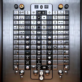
Having been in NYC the last 10 months, I have encountered more elevators than I previously have in the past. I have grown to have some contempt for elevator manufacturers. I just do not understand why the very small number of manufacturers could not agree on some standards. You have your "G", which could mean "ground floor" or it could mean "garage". You have the "L" which could mean "Lobby" or "Lower". Then there's the "M", which could mean "mezzanine" or it could mean "main floor". I have even seen custom letters in some hotels that stand for some special feature on that floor, which of course has no meaning unless you know the secret code. Is "R" a "roof" or a "restaurant"? Do they dare use "G" for "gym"? I do not care what letter they use for what, just the consistency would stop me from pressing the wrong button as I go from one building to the other.
Then there is the inconsistency about where floor numbering starts. Sometimes the first floor it is the same as "main", "lobby" or "ground" floor, but not always. So if you see a "G" and a "1", you really have no idea what is what. The one thing that does add a little bit of sanity is the "star" on the button to indicate the "main" floor to get off (which could be "M", "G" , "L"or "1"). For simple buildings with one exit, this is usually satisfactory, but there are a lot of places with multiple levels of exits and one usually does not know exactly what level they entered on. You can enter from the street and not be on the "ground" floor, or you can enter in way where you have no idea what level you are on. In those circumstances, how I am supposed to know what they consider the "star" level or exactly what button I need to exit the way I came in?
And my biggest gripe comes from the elevator in my apartment building. The buttons go from "1" to "16", with a"star" on the "1". All this is perfectly good and unambiguous. And what would you expect the LED readout to show when you reach floor "1"? You would expect to see "G" naturally. They could not even stay consistent within a single elevator design.


